Techssocial | Having a logo is crucial for every company, it’s a vital part of the business. It has equal importance as the other elements of the brand and is always placed next to the brand name. As there are a lot of companies in the market, you need to find your unique identity which differentiates you from others. For that reason, logos play a critical role.
The human brain is hardwired to remember visuals more easily and that’s the reason why logos are important for companies. People would recall your brand just looking at the logo if it’s perfectly designed. Even companies are investing a lot of money in business logo design and emphasizing it. Clever use of various design elements let you craft appealing logos.
When it comes to the attractiveness of the logo, fonts, and colors are the most important thing that needs to be taken care of. They are the first thing that viewers would observe in the professional logo design, so you need to make the best use of it. Therefore, let’s discuss some of the best fonts and colors for your logo.
Table of Contents
Font combinations
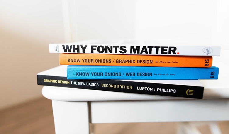
Fonts are really important when it comes to designing a logo. The brand name is the most observed part of the logo and that must be written with a unique and legible font. You can use more than one font in the same custom logo design but make sure that it’s from the same category if possible to make it appealing. Even it should not look complex by adding more fonts in the single logo.
01. Rockwell and Bembo
One of the best font pairings that you can use in your professional logo design. Rockwell has a great amount of personality and attention capturing power when used in the logo.
Bembo is an elegant yet versatile font that gives your logo an appealing look for sure. The thin version of this font can be an outstanding choice for your logo. Therefore, use this font pairing for your logo, it will surely give an eye-catching look.
02. Amatic SC and Josefin Sans
Another great pair of fonts for your logo. It would be the best choice if you want to evoke a playful message through a custom logo design. That means for artists, musicians, entertainers this would be the best choice for the logo.
Amatic SC is the perfect choice for the title whereas Josefin sans are for the body text. That means you can consider the title as the brand name and body text as the tagline of the logo.
03. Montserrat and Courier New
Montserrat is designed by Google. It has become very popular and widely used by people across the globe. You will find this font at various places online.
This simple, sleek, and sans serif font holds the personality of your brand very nicely. This combination evokes the feeling of the past and present which suits the company.
You may also like Pros & Cons of Trendy Logo Designs 2020
Color combinations
Another very important thing that every designer needs to consider while designing the logo. It must be chosen very carefully. Color is the best and powerful way to engage the people with your brand. Human eyes are more likely to remember the colors and that’s why designers emphasize more one color.
Each color has some meaning which designers need to understand before using it. The color psychology has great significance when it’s used in business logo design.
01. Black and Yellow
The best color combinations that you can use for your logo. This light and dark combination looks outstanding in the professional logo design.
The yellow defines happiness, optimism, creativity whereas black evokes strength, authority. So, if you want to showcase any of the meaning to your customers then this would be the best selection.
02. Yellow and Green
The perfect color combination for brands related to agriculture and the environment. The calm green and creative yellow best choices to showcase the personality of the company doing work related to nature.
03. Pink and Navy Blue
Another great combination for any custom logo design. This pairing is very noticeable when used in the logo.
Pink also can be in various interpretations like lighter and brighter whatever suits your brand personality and with other colors. It’s a very neutral combination that can be used at many places along with a logo. It’s also important to understand the meaning of colors and where it can be applied to get the best result. Thus, it’s a great choice for your logo to make it eye-catching.
Wrapping up
Designing a logo isn’t an easy task. Designers need to take care of a lot of aspects to present the best result. The proper use of various design elements is necessary. Understanding the psychology of fonts and colors is vital for designers to craft creative logos. The above-mentioned points clearly define what combinations you can follow for the font and color to give an appealing look to the logo.
Hemant is Digital Marketer and he has 6 + years of experience in SEO, Content marketing, Infographic etc.