Trend Arrows can help you add an attractive look to your Excel reports. Let’s start step-by-step Guide
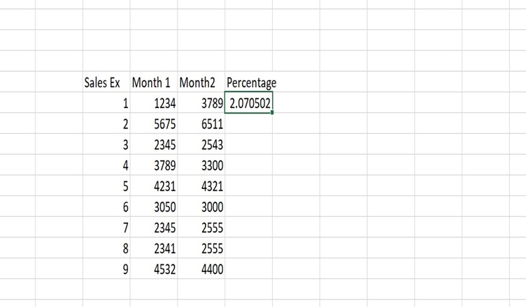
- Add the data for 2 months and in 3rd column add the percentage by adding simple formula: =(new data- old data)/old data. You will get a clear idea from the image.

- Once you adding data in 3rd column, then select the column and click on the number and then percentage to show the data in percentage.

- Once its done, click on Insert and then symbol, select the font of your choice, I have done it arial and shap geometrice you will find upside downside arrows.
- Copy those arrows, then select the complete column data where you added the percentage. Right click, then click format cells, select custom option.

- In the type part, add Upside downside arrows which you copied and add a formula as shown in image.

Note: You can add the color of your choice.
Read more about Excel at Techssocial
Hemant is Digital Marketer and he has 6 + years of experience in SEO, Content marketing, Infographic etc.